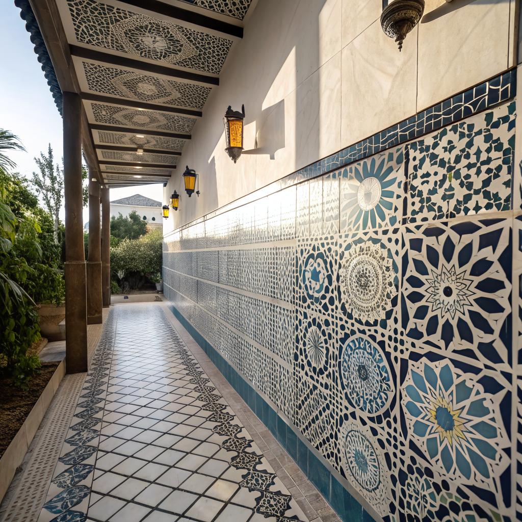
I was sitting in a campus makerspace one night, watching three people argue about paint colors, when I noticed something odd: everyone kept taking photos of the wall, not their projects. The wall was covered in hand-cut tiles that looked slightly uneven, glazed in soft colors, and it seemed to steal the focus without even trying.
Students like these spaces because they feel alive, and that is the short answer to why so many creative hubs are turning to zellige mosaic tile. The tiles are imperfect, textured, and a bit unpredictable, which fits the mood of student projects and startup ideas much more than flat white drywall or plastic panels.
What makes zellige mosaics feel “right” for student spaces?
If you ask students what they like about these tiles, you rarely get very technical answers. You hear things like:
“It looks like the room has a history, even if the building is new.”
Or:
“The tiles are not perfect and that makes me feel less pressured to be perfect.”
At a surface level, zellige mosaics are just small clay tiles, often hand cut, glazed in layered colors, then arranged into patterns or loose fields. But for campus creative hubs, that surface level matters a lot.
Here is what often happens in these spaces:
- Students need rooms that do not feel too formal or stiff.
- They want backgrounds that look good on camera for pitches, demos, and content.
- They respond to details that hint at craft, culture, and story.
Zellige mosaics tick all three boxes without shouting. The surface catches light in an uneven way. The grout lines are not laser perfect. The color shifts tile by tile. All of that reads as “handmade” and “real”.
The short version: zellige mosaics make a space feel finished but not final, which is exactly how creative work feels for most students.
Texture, light, and the way students actually use rooms
Students do not just sit at desks anymore. They record video, stream workshops, shoot product photos, and take a lot of casual photos of whiteboards, sticky notes, and prototypes. Backgrounds have become part of their toolkit.
How zellige mosaics play with light
Handmade tiles are not perfectly flat. Some are slightly bowed. Some have tiny chips at the edges. The glaze pools in small dips. Under different light setups, that becomes a quiet visual effect.
You get:
- Soft highlights where the glaze catches direct light
- Darker, deeper tones in the low spots
- Subtle shadows along the uneven edges
None of this is dramatic. It just stops the wall from looking dead on camera.
A student filming a short pitch video in front of a tiled section suddenly has depth behind them. A photo of a prototype on a tiled workbench looks more intentional. No fancy set design, just a wall that does a bit of visual work.
Why flat walls often fail in creative hubs
Plain drywall or vinyl panels feel safe at planning time. They are easy, neutral, and cheap. Then the space opens, and people realize:
- Fingerprints and smudges show up fast
- White walls bounce harsh light and blow out photos
- The room looks like a generic office, not a place where new ideas are welcome
Zellige mosaics are not a magic fix, but they solve some of this. Smudges blend in more. Minor damage looks intentional. If a tile cracks, it looks like character, not failure. And the room stops looking like a conference center.
The psychology of imperfection and why it helps students
Most students in creative hubs are dealing with a weird mix of pressure and freedom. They are told to experiment, but also to get results fast. The environment around them nudges them one way or the other more than they admit.
Why irregular tiles feel safer than perfect panels
A perfectly finished, glossy corporate-style space can feel intimidating. You walk in and feel like there is no room for error. Some students quietly shut down in those rooms.
Handmade mosaic tiles send a different signal:
- Edges do not line up exactly
- Color is not perfectly uniform
- Glaze has small bubbles, specks, or lines
None of this screams “messy”. It just says “human hands were here”. When the room accepts flaws, people often feel more willing to share half-baked ideas or rough prototypes.
I once watched a student pitch a half-working hardware project in front of a wall of green and off-white zellige. The demo failed halfway through. She laughed, pointed to a tile with a visible chip, and said, “This room gets it.” The tension dropped. Everyone relaxed. That sort of moment is small, but it matters.
Spaces that age with students, not against them
High-traffic student rooms age fast. Chairs scrape. Posters go up and come down. Drinks spill. Neat, fragile surfaces fall apart in a year.
Zellige mosaics do something odd. As they age, they just look more intentional. Grout gets a little darker. Colors mellow. A chip here and there feels normal.
For a creative hub, that means you do not have to repaint every exam season. The space can hold years of projects without looking tired, which sends a quiet message:
“Things can change here, and the room will still hold together.”
That sense of continuity can give student founders and makers a bit more mental room to experiment.
Cultural story and identity on campus walls
Many universities and colleges are trying to show that they care about diverse backgrounds, global ideas, and different ways of working, not just in words but in architecture.
Zellige mosaics come from a long ceramic tradition that still feels present in many cities, not like a museum piece. When a campus uses them, it is making a choice that can say a few things at once:
- We value skilled craft, not only software and screens
- We respect visual traditions that did not start in tech parks
- We want student spaces to have roots, not just glass and metal
This can land especially well with students who grew up around tiled courtyards, patterned floors, or richly ornamented buildings. They walk into a hub and do not feel like they stepped into a spaceship. They feel some continuity with their own backgrounds.
Of course, it is easy to get this wrong and use cultural references as decoration only. Students are quick to call that out. The spaces that work better are often the ones where tiles are used with care, not as random “exotic” accents, but as integrated parts of a thoughtful design.
Practical reasons students keep voting for zellige with their feet
If a campus space is always booked, it means students like it. When you look at sign-up sheets and usage data, zellige-tiled hubs often show up more often than plain rooms with the same equipment.
Sound, mess, and maintenance
Tiles are hard surfaces, so at first you might think they would make a room noisy. In practice, what usually happens is that architects combine them with softer materials: rugs, soft seating, acoustic panels on the ceiling.
That mix works well because:
- The tiles handle splashes, marker stains, and general grime
- The soft elements handle echo and comfort
- The whole room feels more layered and less sterile
Where do students naturally move sticky drink cans, random circuit boards, clay prototypes, and marker-stained hands? Toward tiled zones, not fabric.
Maintenance teams often grow to like these surfaces. A quick wipe deals with most messes. Damaged tiles can be swapped individually instead of replacing full panels or repainting whole walls.
Wayfinding and “I meet you by the blue wall” moments
On many campuses, creative hubs are hidden in basements or long hallways. A wall of deep blue or warm green mosaic tiles becomes an easy landmark.
Students stop saying “Room 206A” and start saying:
“Meet you in the space with the green tile wall after lab.”
It sounds small, but it speeds up collaboration. People remember places that look different. They are easier to give directions to. Newcomers find them faster. That alone can change how often first-years or people from other departments drop in.
How zellige tiles show up in different student zones
Not every creative hub is the same. Some focus on hardware, some on software, some on art, some on social projects. The way zellige mosaics work in each can shift a bit.
Prototyping labs and makerspaces
These are messy rooms. Things get cut, drilled, painted, soldered. It is easy to assume tile does not belong here, but it often does, just not everywhere.
Common placements:
- Backsplashes behind sinks and cleaning stations
- Low walls around messy work benches
- Columns or small zones that act as visual anchors
The main work surfaces still need to be suited for tools. But the tiled sections become safe zones where people feel okay leaning, gathering, or snapping photos.
Students seem to like taking “progress shots” of their projects against these tiled backgrounds, especially when the colors contrast with the prototype.
Media labs and content studios
This is where zellige really shines. Camera-friendly surfaces are half the job in these rooms.
In media hubs, you often see:
- One full accent wall in a muted tone like deep teal, charcoal, or sand
- Smaller tiled sections near podcast tables or interview corners
- Mosaic patterns behind stage-style lighting setups
The irregular reflection of the glaze gives a nice effect under ring lights and softboxes. It avoids the flat glare you get from some glossy paints.
Students care about this more than planners sometimes expect. They know when a background will look good in a thumbnail or a pitch deck. They choose those spots for filming without being told.
Startup lounges and co-working corners
Startup teams often work in a grey zone between campus and the outside world. They meet mentors, visitors, and possible partners. They want the space to feel serious enough for business, but relaxed enough that it still feels like their zone.
Zellige mosaics add a subtle “we thought about this” vibe without going full corporate.
You might see:
- A tiled coffee bar splashback
- A low divider wall wrapped in small-format tiles
- A narrow band of mosaic along a hallway that leads into the hub
These touches make the lounge feel like a place someone cared about designing, not just a recycled classroom.
Comparing zellige mosaics with other common surfaces
Sometimes it helps to spell out the difference. Here is a simple comparison that reflects what many students quietly notice, even if they do not say it out loud.
| Surface | Visual feel | On camera | Durability in student use | Psychological effect |
|---|---|---|---|---|
| Plain painted drywall | Flat, neutral, can feel generic | Can glare under strong lights, looks harsh | Shows scuffs and fingerprints fast, needs repainting | Safe but not very inspiring |
| Vinyl wall panels | Very smooth, uniform | Sometimes too reflective, looks “office-like” | Resists minor wear but can look cheap when damaged | Feels corporate, not very personal |
| Zellige mosaic tile | Textured, varied color and glaze | Soft reflections, good depth, interesting backgrounds | Holds up to spills and marks, ages with character | Feels crafted, warm, and more forgiving |
| Large porcelain slabs | Sleek, high-end look | Can look dramatic but sometimes cold | Very strong, but chips and cracks stand out | Feels finished, maybe too formal for early-stage work |
Of course, the right answer for a given campus might be a mix. But if the goal is a space where students feel allowed to explore, the mosaic option tends to do more quiet work than people expect.
Color choices that actually work in student hubs
Not every color that looks nice in an architecture magazine works in a busy campus hub full of laptops, post-its, and random hardware.
Soft neutrals with depth
A lot of campuses pick some version of off-white, sand, or pale gray for walls. With zellige mosaics, those neutrals get more interesting because of how the glaze pools and shifts.
You can have a mostly white wall, but some tiles lean warmer, some cooler, some slightly cream. Under daylight, it feels calm. Under artificial light, it looks warm instead of clinical.
Students often prefer these neutrals in spaces where they need to focus: quiet corners, study pods, or meeting booths.
Bold color, but not everywhere
Deep blues, greens, terracotta, and charcoal can look great in photos and in person, but if you cover every wall in them, it can be too much.
Most hubs that get it right:
- Use stronger colors on one feature wall only
- Keep the other walls light so the space does not feel heavy
- Repeat the strong color in smaller details like cushions or trim
That way students can choose their background. Need a calm setting for a serious interview? Face the neutral wall. Want a more expressive backdrop for a design reel? Face the bold mosaic.
How students and teams actually adapt these tiled spaces
One surprise with tiled walls is how fast they become part of the creative process, not just background.
Analog thinking on solid surfaces
Students often tape sketches, prints, and post-its to tiled areas, especially around whiteboards. The grout lines act like a loose grid that helps align pages or create rough sections.
I have seen:
- Storyboards pegged across three or four rows of tile
- Product photos laid out along a vertical strip for comparison
- Hand-drawn icons stuck in each tile as a kind of “physical interface”
Because the tiles are durable, no one worries much about a bit of tape or magnets. The wall shifts with the project.
Photo corners and “brand” backgrounds
Campus clubs, startup teams, and makerspaces start using tiled walls as part of their own visual identity without waiting for permission.
They pick a corner with good light and tiles in frame. Then:
- Take consistent team photos there each semester
- Shoot product shots against that background
- Record short update videos in the same spot
Over time, that corner becomes associated with the group. For anyone watching from the outside, it feels like the hub has a recognizable visual style, even if the budget was modest.
Design tips for campuses planning zellige mosaics in hubs
If you are involved in planning or just want to influence your campus decisions, there are some patterns that tend to work better than others.
Start with function, not just aesthetics
Ask some direct questions:
- Which walls will be in the background of photos and videos most often?
- Where do spills or messes always happen now?
- Which corners could become natural meeting or pitch spots?
Tiles are often most useful:
- Near sinks, coffee machines, or fabrication zones
- On the main wall facing a central worktable
- In one or two “hero” spots that will appear in marketing images
Putting zellige in those areas first tends to have more impact than trying to wrap the whole room.
Keep patterns readable but not loud
Complex patterns can be beautiful, but they can also fight with text, slides, and products when they appear in the same frame.
For creative hubs:
- Simple arrangements, like running bond or straight stacked, usually work best
- Subtle color variation within a narrow band (several shades of the same color) feels rich but not distracting
- Save very complex patterns for small feature zones, not whole walls
That way the wall supports the work instead of competing with it.
Think about touch, not just sight
Students will lean on these walls. They will slide bags, laptops, and boxes along them. They will sit on low tiled ledges. That means:
- A slightly rounded tile edge is nicer to the hand than a sharp cut
- Mid-sheen glaze is less likely to show every fingerprint than very high gloss
- Grout color that is not pure white will look better after heavy use
If the room feels good to the touch, people stay longer. That gives projects more time to grow.
Do students care about where the tiles come from?
Some do, some do not. You might be tempted to think that nobody will ask, but that is not quite true.
In many hubs, there will be at least a few students who want to know:
- Are the tiles made with responsible sourcing?
- Are they produced in a way that respects craft workers?
- Is the design borrowing from a culture without giving credit?
If the campus is going to use a visual language that has long roots, it should be ready to answer these questions honestly. That does not mean writing a long essay on the wall, but a short plaque, a line in a tour script, or a page on the hub site can go a long way.
In some places, studios even invite designers or craftspeople with experience in tile traditions to speak to students. That turns the wall from a decoration into a quiet teaching tool.
Common mistakes when using zellige mosaics in creative hubs
Not everything about these tiles is perfect. There are some easy traps to fall into.
Overloading small rooms with strong color
A tiny windowless study pod fully wrapped in dark glossy tiles can feel like a cave. It may look dramatic in a rendered image, but hard to sit in for three hours.
Better:
- Use lighter tones in small, enclosed rooms
- Keep darker, richer tones for larger, more open spaces
- Add good lighting that shows the texture without glare
Ignoring acoustics
Tiles reflect sound. If the rest of the room is also full of hard surfaces, you get echo and fatigue. Some projects forget this.
An easy fix is to:
- Add acoustic panels to the ceiling or high walls
- Use upholstered seating and soft rugs in seating zones
- Break up big tile expanses with shelves, plants, or pinboards
This way you keep the visual quality of the tile without turning the room into a hard box.
Using fake “handmade” patterns that feel off
Printed panels that imitate zellige from a distance often look flat up close. Students notice. They may not complain directly, but they treat the room with less care. It reads as decoration, not craft.
That does not mean every tile has to be ultra-expensive or imported, but some real irregularity in cut or glaze makes a big difference in how the space feels.
A quick FAQ about zellige mosaics in student creative hubs
Do students actually notice the tiles, or is this just a design trend?
Most will not use the word “zellige”, and many will say things like “I like that wall” instead of naming the material. But they notice. You can measure it in how often those rooms show up in photos, how often they are booked, and how many projects use the walls as a backdrop.
Are zellige mosaics too fragile for heavy student use?
Individual tiles can chip if hit hard, but in normal use they hold up well. In many cases, they outlast paint and basic laminates. Small chips can even blend into the texture. For truly high-impact zones, you can combine tile with tougher guards or panels at floor level.
Are they only for “design” or “art” hubs?
No. Some of the best uses are in cross-disciplinary spaces where engineers, business students, artists, and researchers all cross paths. The tiles do not belong to one field. They just make it feel more natural for people to stay, talk, and share half-formed ideas.
Is this just about making things look pretty?
Looks matter, but students keep coming back to these spaces for more than that. The imperfect texture, the way the light behaves, the cultural story, and the durability all combine to create rooms that feel more human, less like temporary classrooms.
So if your campus is planning a new creative hub, it is fair to ask: will the walls help students do their best work, or will they just stand there?